Service: Branding
Asset: Logo Update/ Spruce up
Usage: Brand Identity
Industry: Photography
Client: Angie Tabaczynski
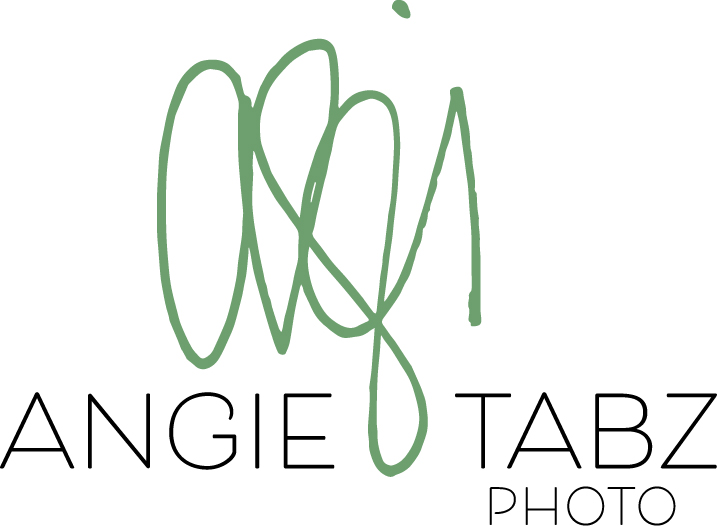
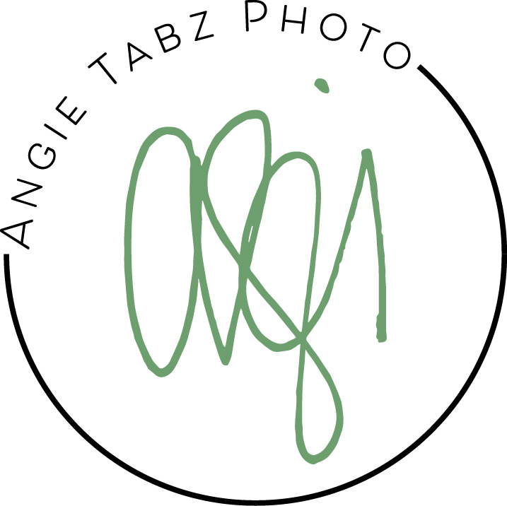
In the world of design, the evolution of a brand’s visual identity is not just about change; it’s about progress. Angie’s logo is a good example of the transformative power of design, illustrating how font and color refinement, and versatility converge to elevate a photographer’s brand.
This started as Angie reached out to edit her logo. Being an artist herself, Angie was easy to communicate with. In discussion we both agreed that since the signature on her logo was already a much recognized component on her website as well as her other marketing tools, we would retain the core element and tweak it.
The other aspect of the design involved font and color selection. Opting a contemporary font style that has withstood the test of time ensured we could strike the perfect balance between modern appeal and traditional aesthetic.
With a recognizable icon, thoughtful font choices, and a refined color palette, a redesigned logo will not only meet immediate needs but also position the brand for sustained success across diverse media channels.


